Menfess.co
Development of a new payout method page to reduce friction and improve user satisfaction
2024 • 1 month • React Native • Co-Founder & Design Lead
Live website →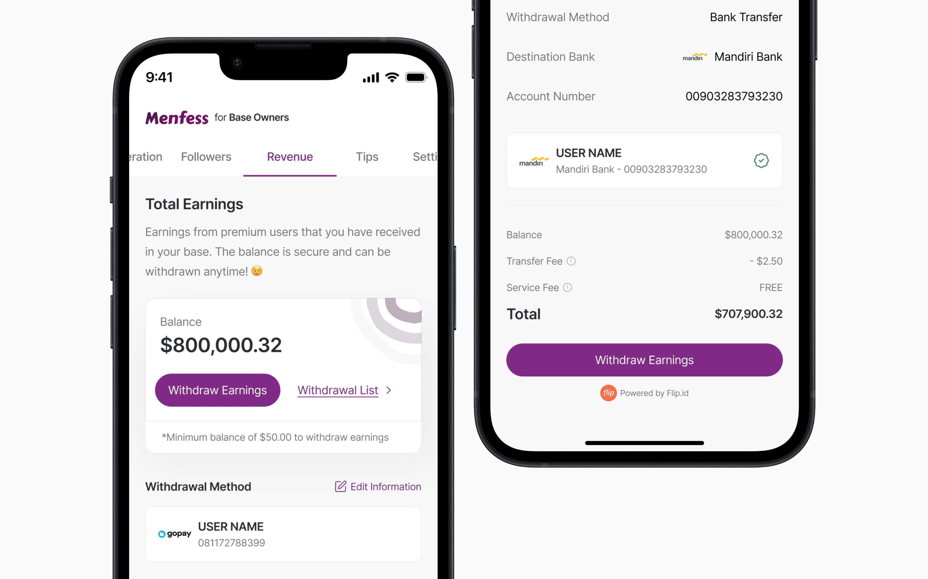
What is Menfess.co?
Menfess.co is a platform where users can confess their thoughts and feelings in X/Twitter.
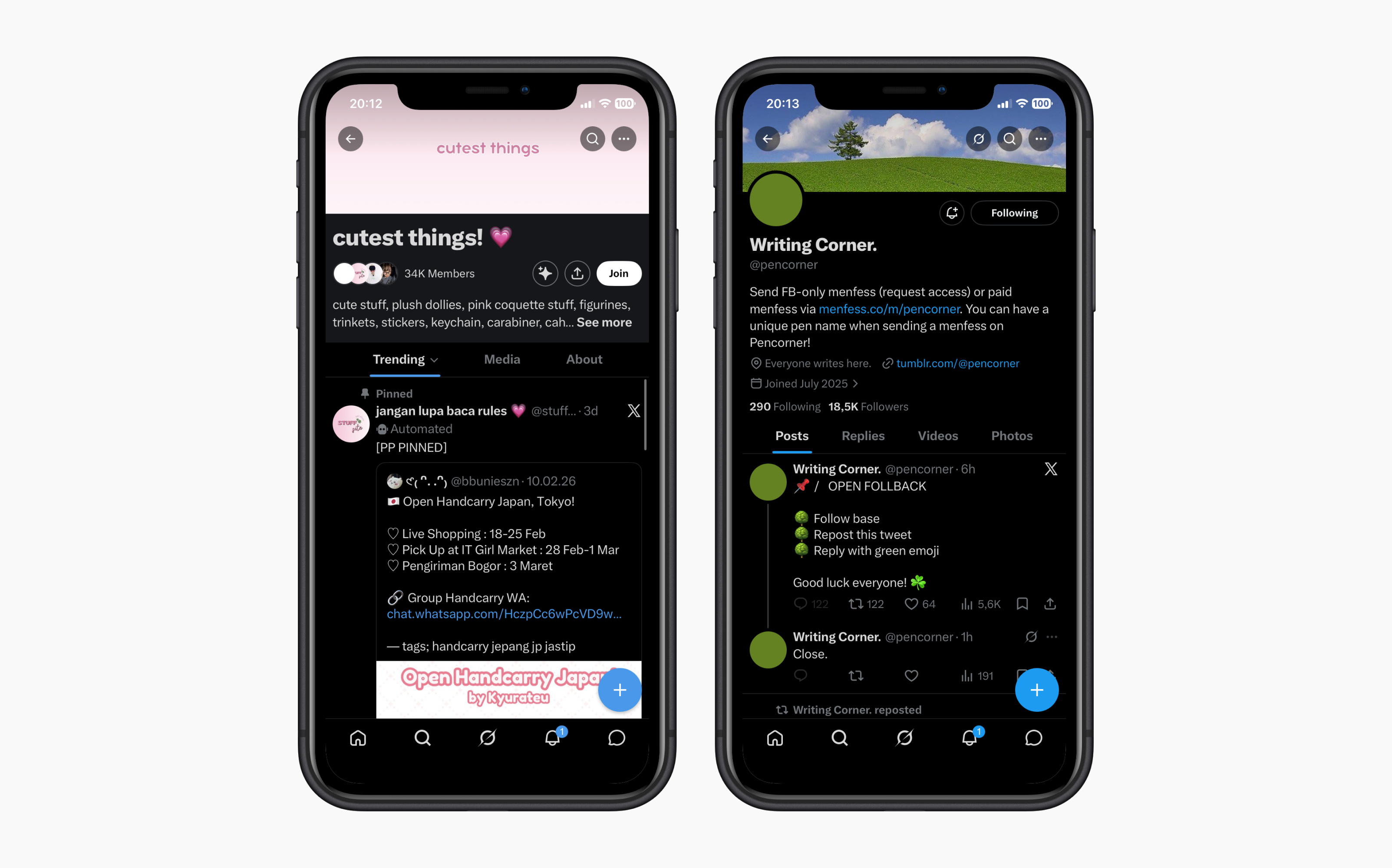
Menfess.co is a community-driven platform built on X (formerly Twitter) that facilitates anonymous discourse through automated 'base' accounts. Functioning as a decentralized forum system within the Twitter ecosystem, it enables users to submit confessions and messages via Direct Message, which are then automatically broadcasted to a network of community accounts.
Right now we have 50+ community accounts and serving around 7000 monthly active users. These communities are managed by people we call Base Owners.
Being a co-founder
I joined Menfess.co as a co-founder and design lead in early 2022. I was responsible for leading the design and development of the new payout method page, which was a critical feature for our users. I worked closely with our product manager, Semaya and Full-stack Engineer, Alam to ensure that the new design was not only visually appealing but also functional and easy to use.

Our top complaint
We had a major issue with how we do our payouts to our customers.
Originally, payouts to base owners were handled through a manual process via Telegram. When an owner requested a payout, they had to message us directly so we could initiate a manual bank transfer. This method was inefficient, often taking 3–5 business days or longer during public holidays. We recognized this as a major friction point, as our users required a more streamlined and automated way to withdraw their earnings.
Business model mapping
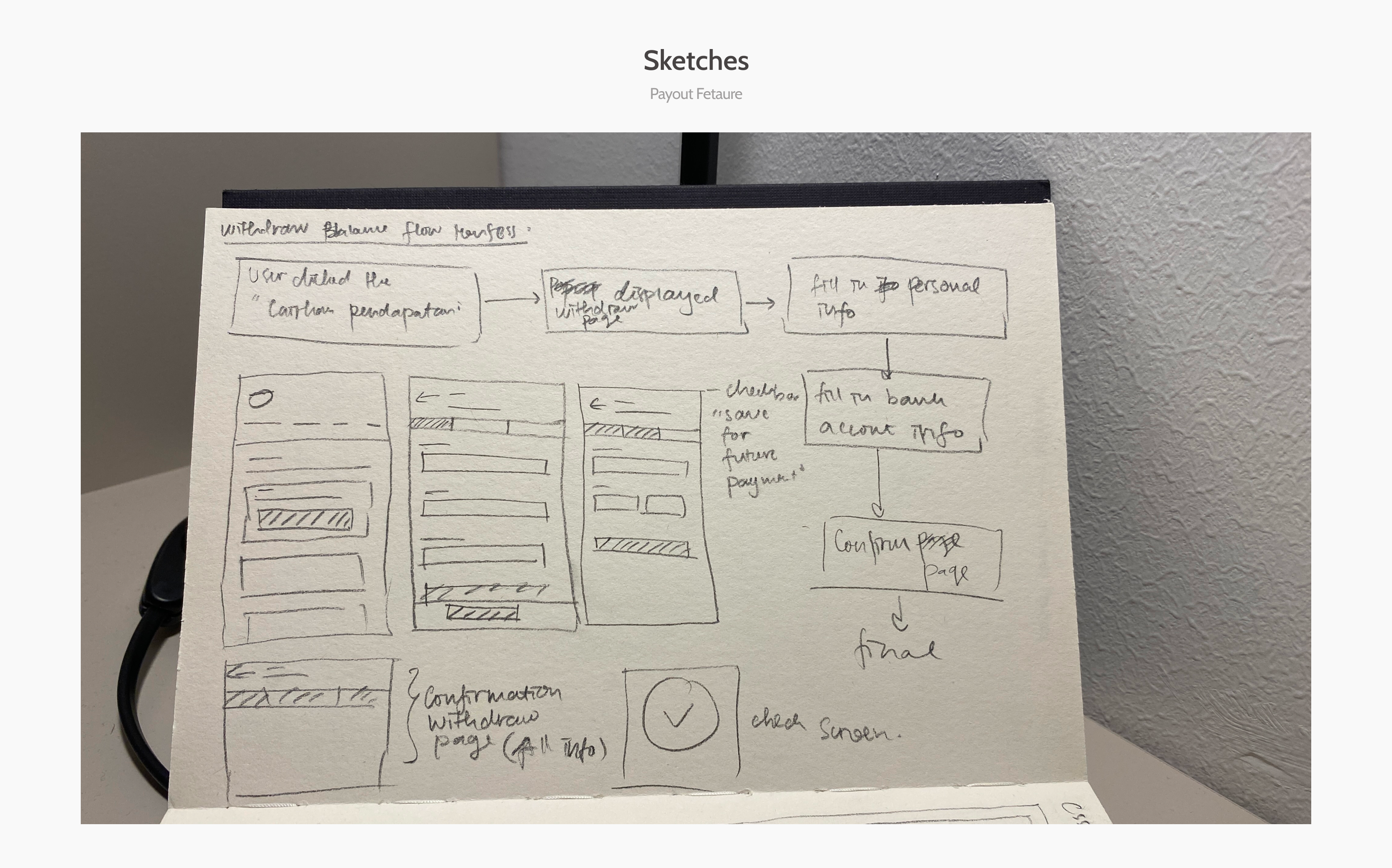
I began by visualizing the business model and mapping out the underlying user flows.
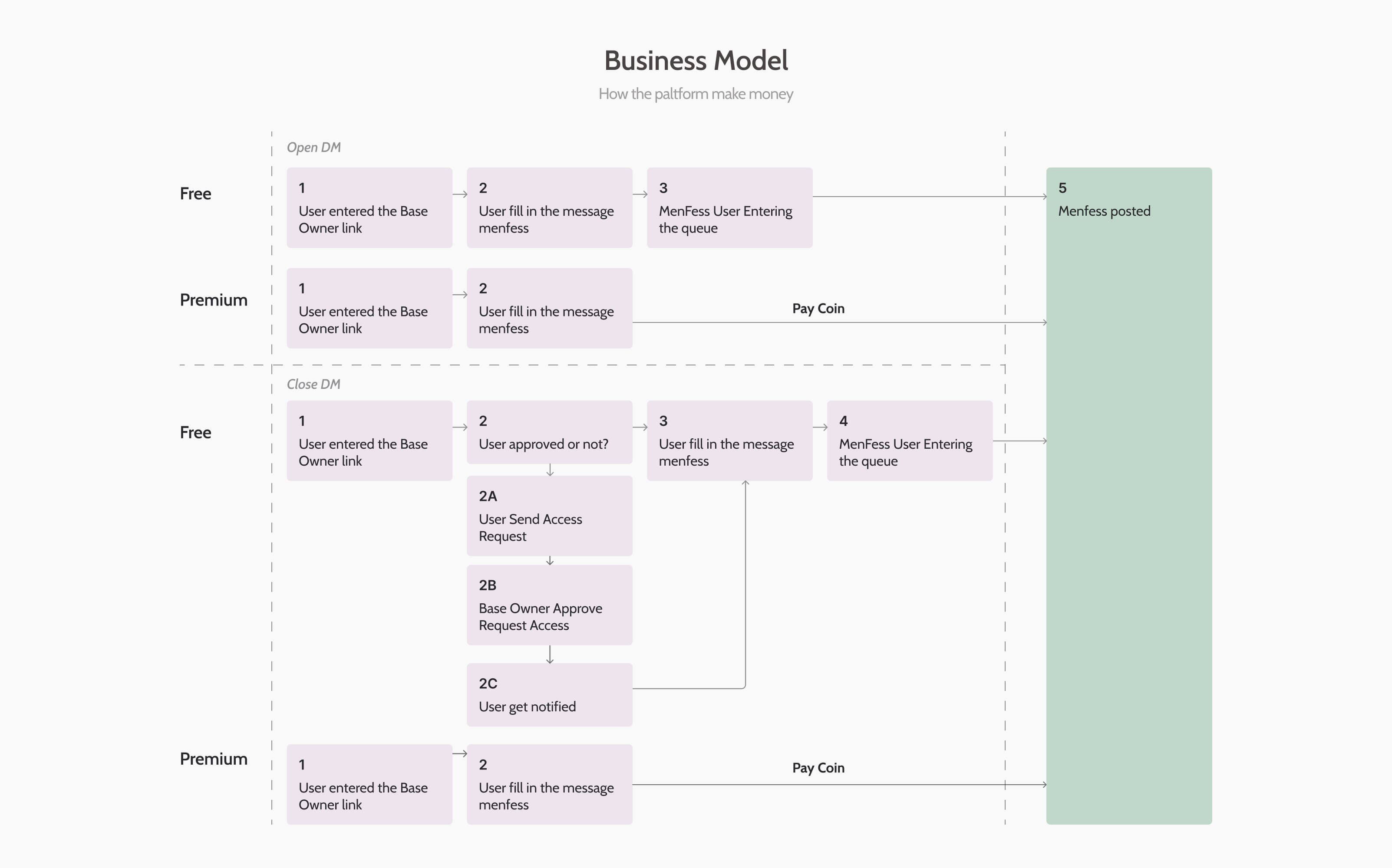
I firmly believed that a comprehensive mapping of our business model was essential to identify the most logical place for the new payout feature within the app. By visualizing the entire ecosystem, how premium coins are purchased, how they're spent on 'menfess,' and how that revenue is eventually distributed, we were able to narrow down the ideal user journeys. I organized a workshop with our product manager to bridge the gap between business requirements and technical feasibility, ultimately defining a roadmap that would move us from manual Telegram transfers to a fully integrated, self-service dashboard.
Design Explorations
I explored multiple design directions to ensure the payout feature felt like a native part of the existing ecosystem.
My design process began with extensive competitive research, analyzing how leading platforms handle financial transactions and payouts. I distilled these findings into a visual moodboard to guide my aesthetic and functional decisions. Building on the core user journeys we defined earlier, I translated these concepts into high-fidelity screens, focusing on clarity and ease of use. This phase allowed me to iterate quickly and present a series of refined design options to the team for final feedback.
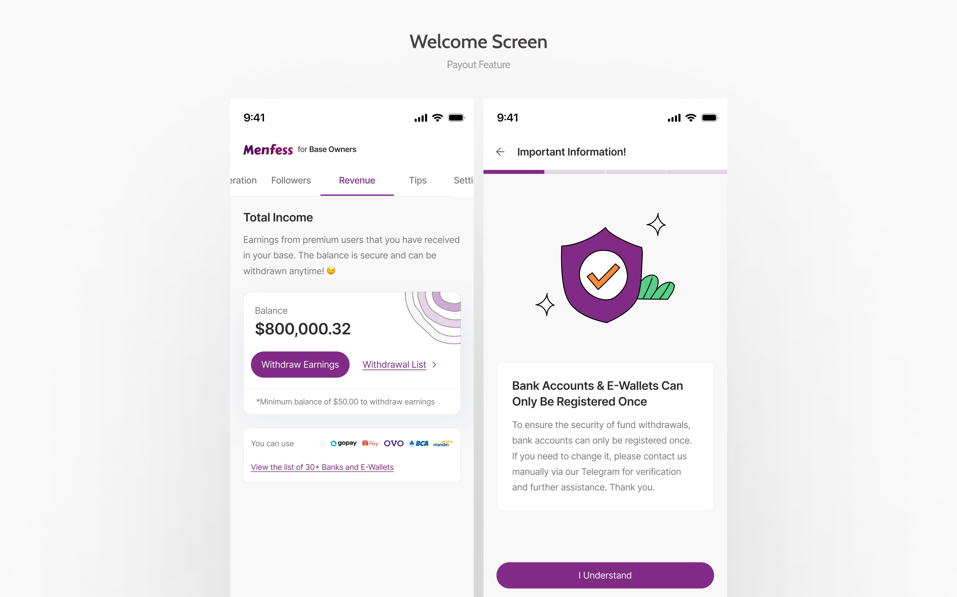
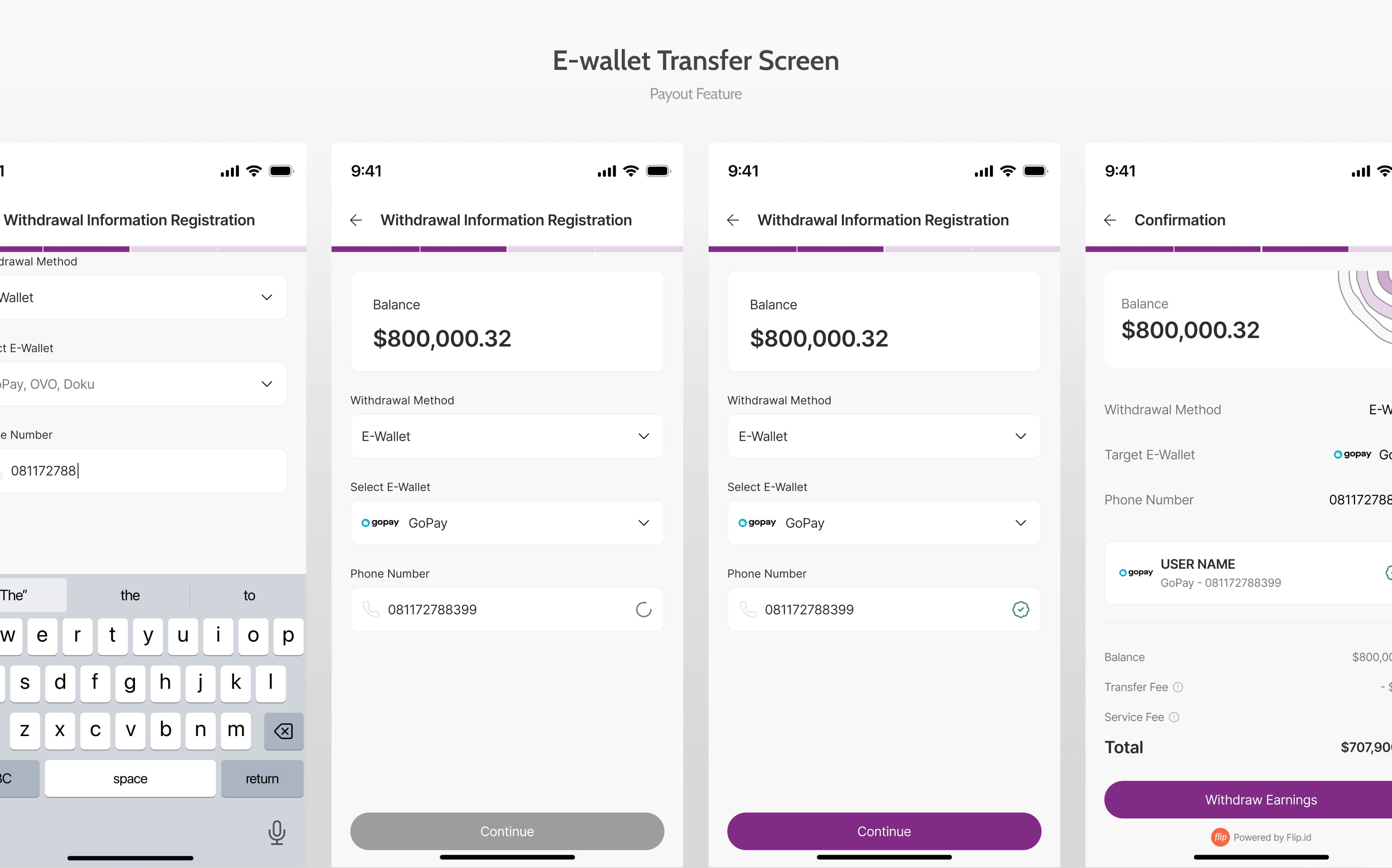
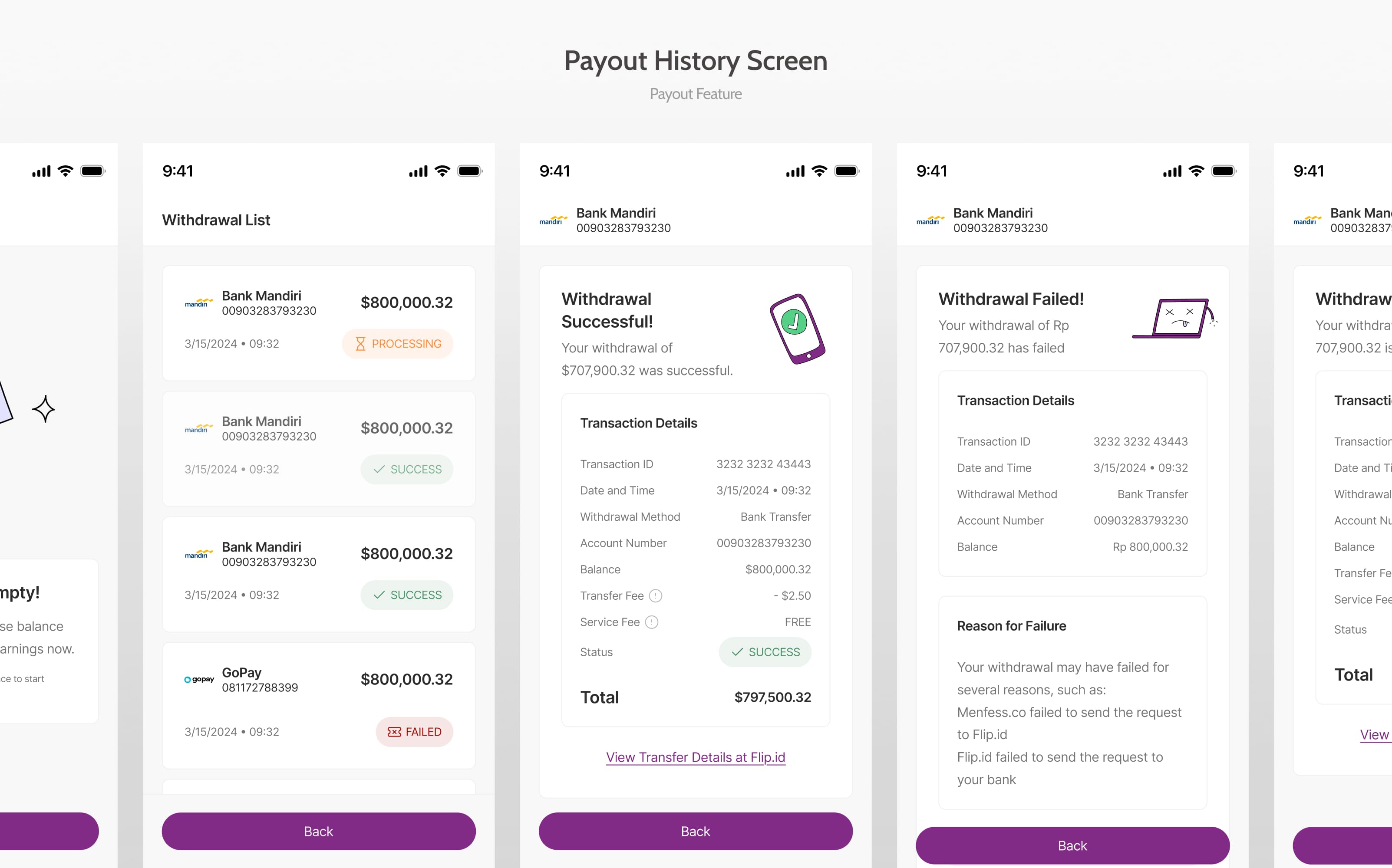
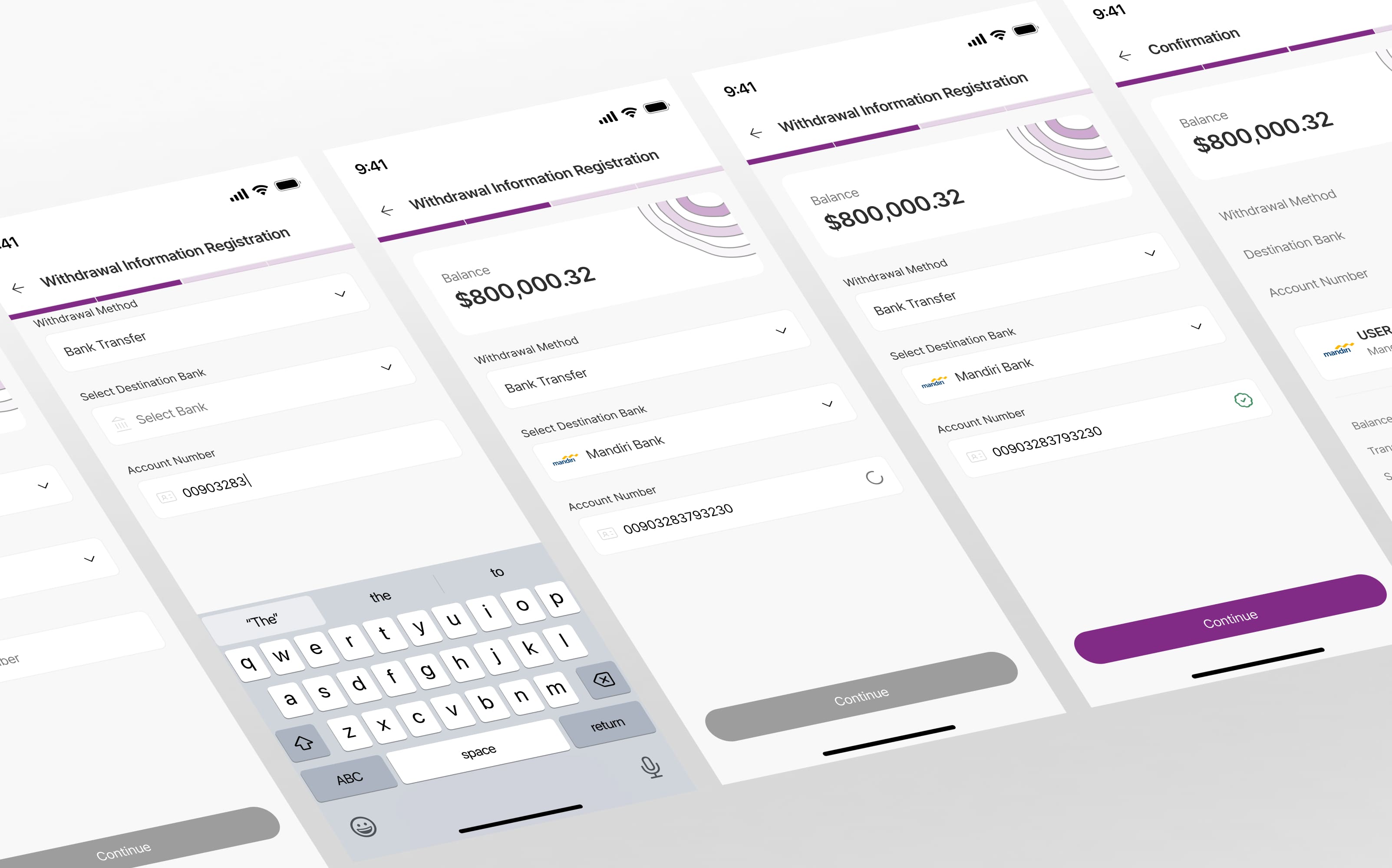
Final Designs
After several iterations, we finalized the designs for the payout feature.
We kept the aesthetic consistent with the app's existing design system, while also incorporating elements that would make the new feature feel special and premium. The final design was a clean, modern interface that was easy to use and understand.
Impact and learnings
The magic of 80/20 principle
Initially, our focus was on building the whole platform end-to-end first. But real traction came from fixing Base Owners individual issues. This taught me the importance of identifying and deeply understanding the most invested users, even if they aren’t the obvious target at first glance. As Design Lead, I learned how to properly apply the 80/20 (Pareto) Analysis & Thinking (i.e. creating product & customer segmentation based on their revenue contribution).
Base Owners gravitated to the product because it was clear and easy to use. As design leaders, we often get excited about perfecting & providing advanced features, but this project reminded us that readiness & simplicity scales, especially when users are juggling chaotic workflows.
Team
2 amazing & smart people I had the pleasure of working with on this project
.gif)
Sulthan Alam - Tech Lead
Semaya Krista - Product Manager
Other Projects
-portrait.png)
.png)