Start Club Arnhem
Skyrocketing startup community sign-ups and engagement
2021 • 2 Months • Responsive Web • Web Designer
Live website →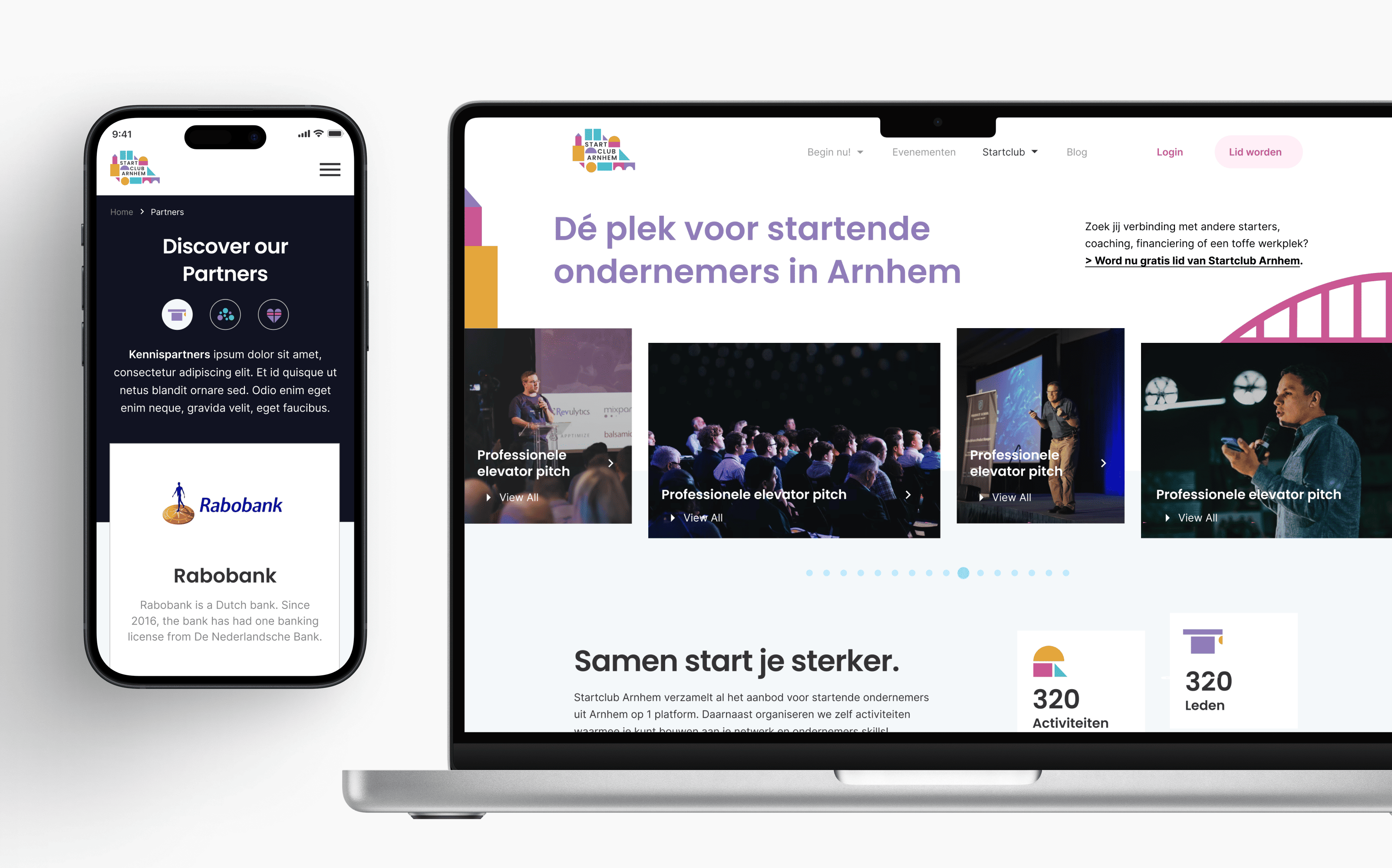
Background
A Startup Community in Arnhem, NL called StartClubArnhem
StartClubArnhem (SCA) is a fresh and quirky club for everyone who is starting or has just started his or her entrepreneurial journey in the Arnhem, Netherlands region. Through events, coaches, Knowledge Bank (Kennisbank), and blogs, Startclub Arnhem provides startup founders with the tools they need to grow their businesses.
The Problem
The current website is outdated and doesn't reflect the brand's personality
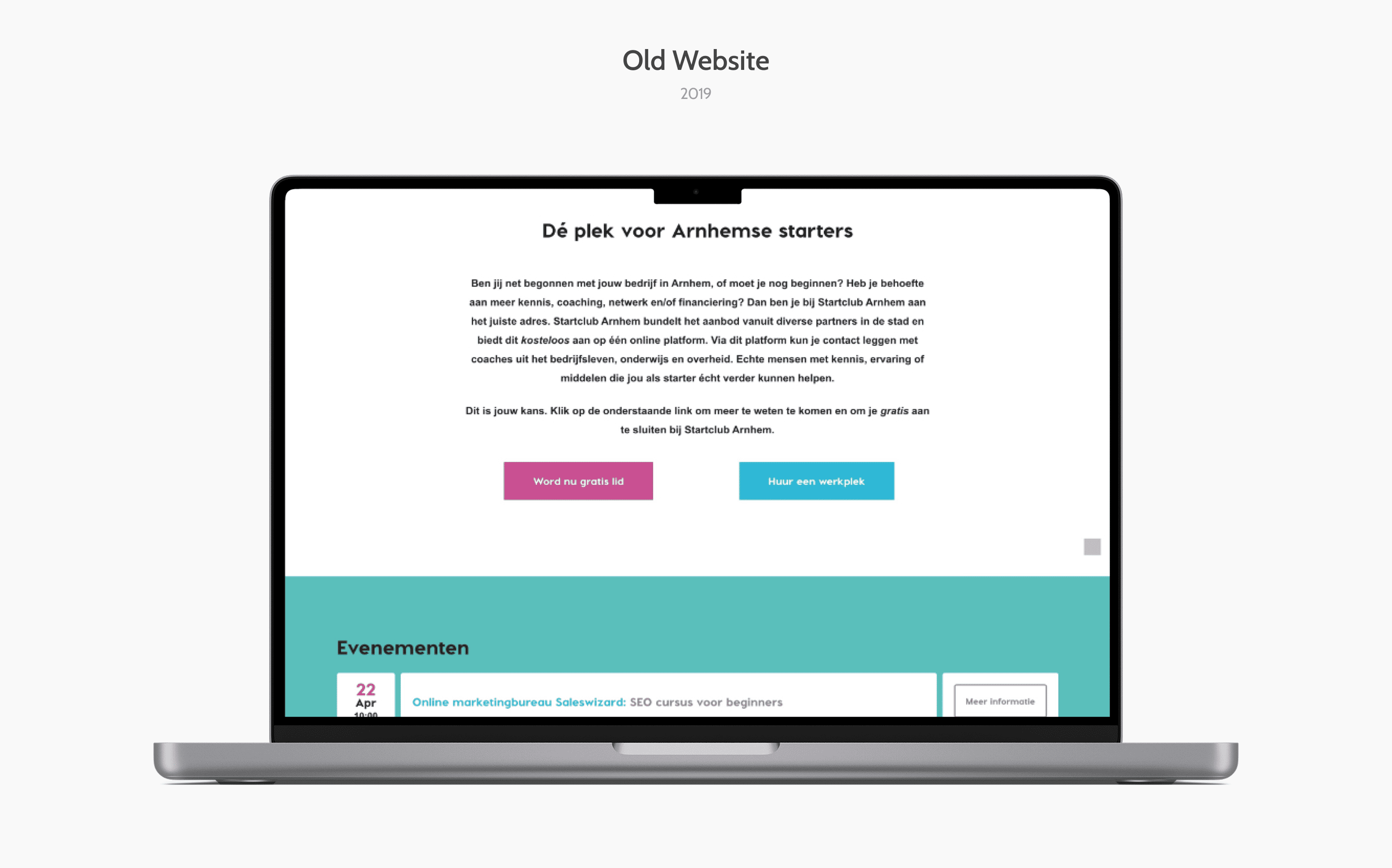
The existing website lacked engagement, credibility, and professionalism. Additionally, the user experience was not intuitive, making it difficult for visitors to convert into members.
Brainstorming
We did several brainstorming sessions to understand the core of the organization
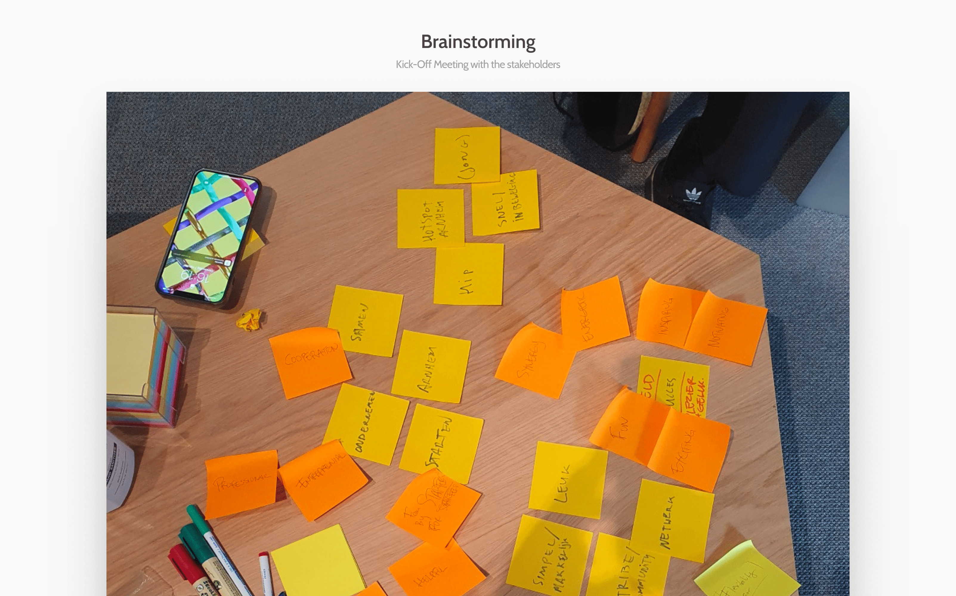
The meeting involved the SEO team, developers, a project manager, and myself. We discussed ways to redesign the existing website to be more attractive and increase visitor conversion. A primary concern was the tight deadline, which we addressed by developing a phased implementation strategy.
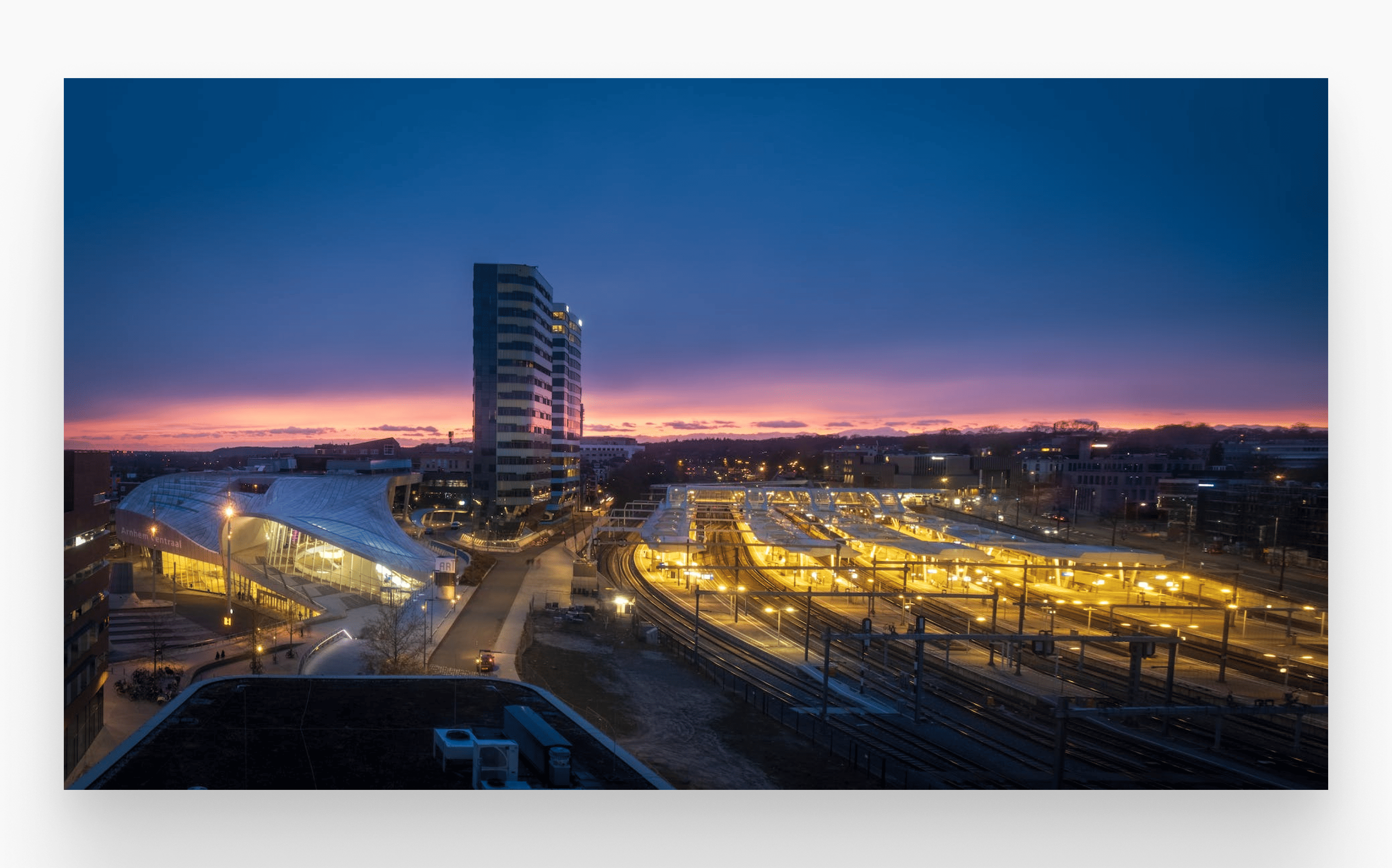
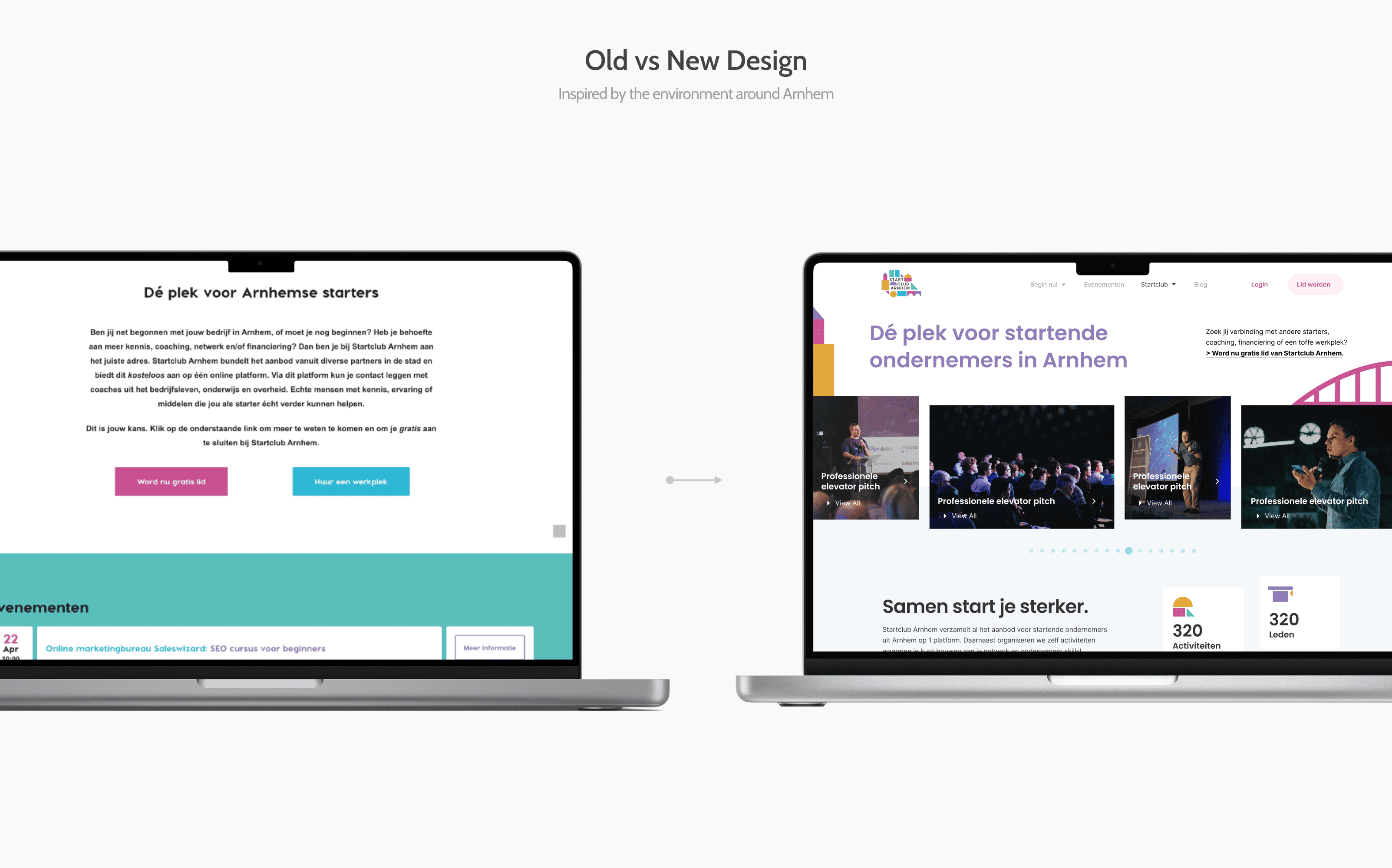
Crafting the brand
Inspired by the environment around Arnhem
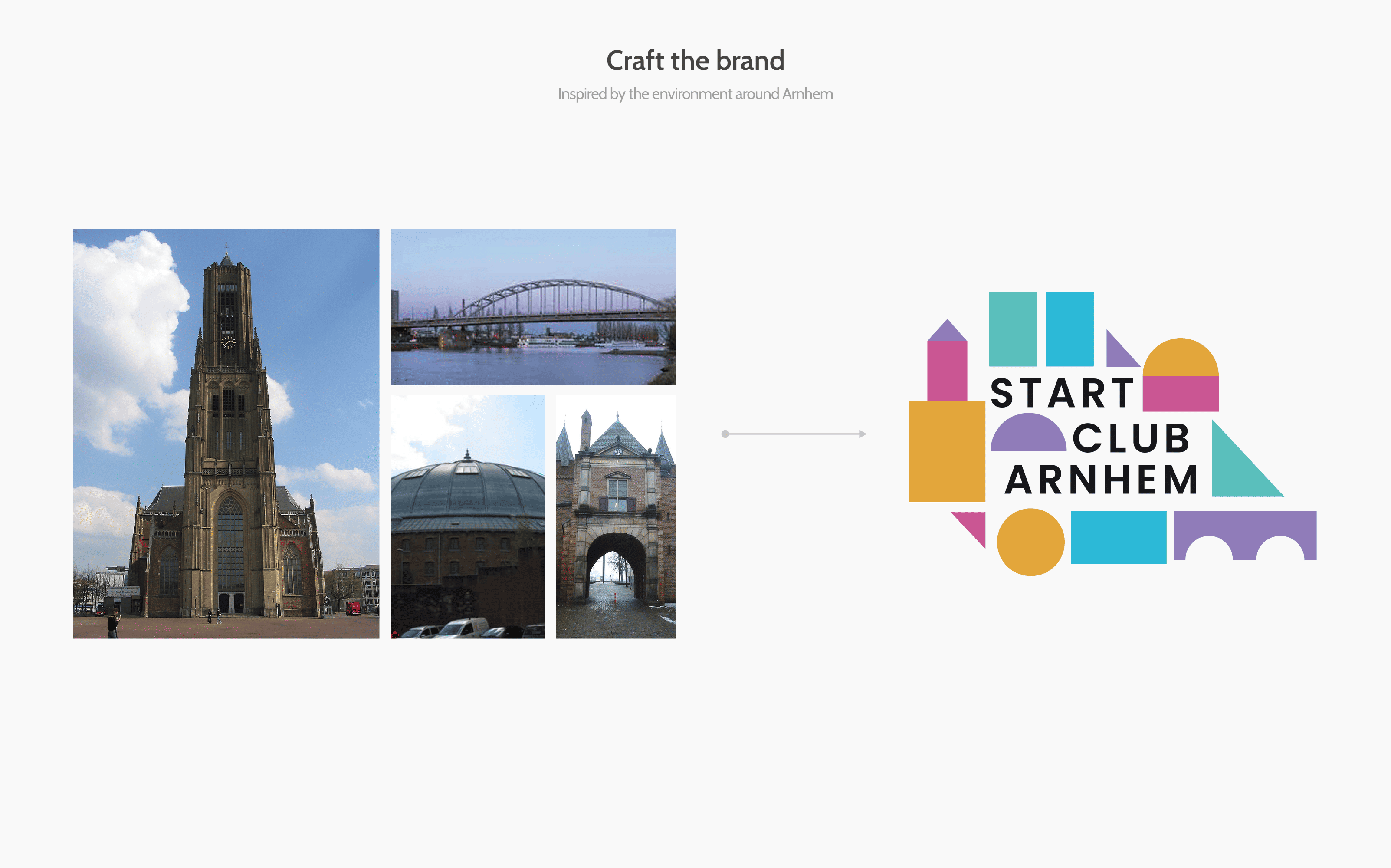
By refining the brand, StartClubArnhem established a consistent identity that is easily recognized by members and visitors alike.
Target Audience
Who is SCA for?
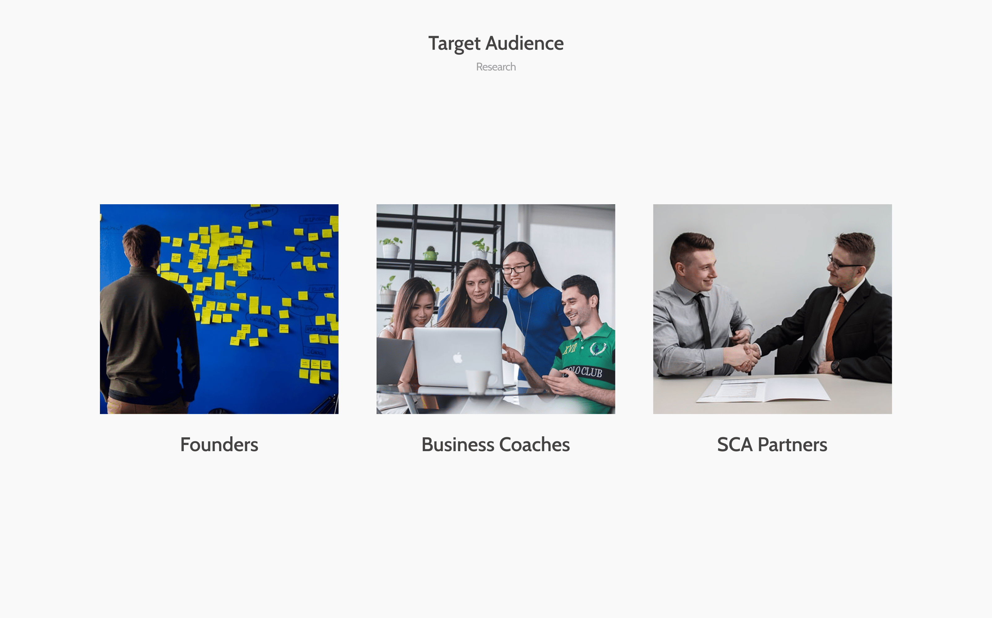
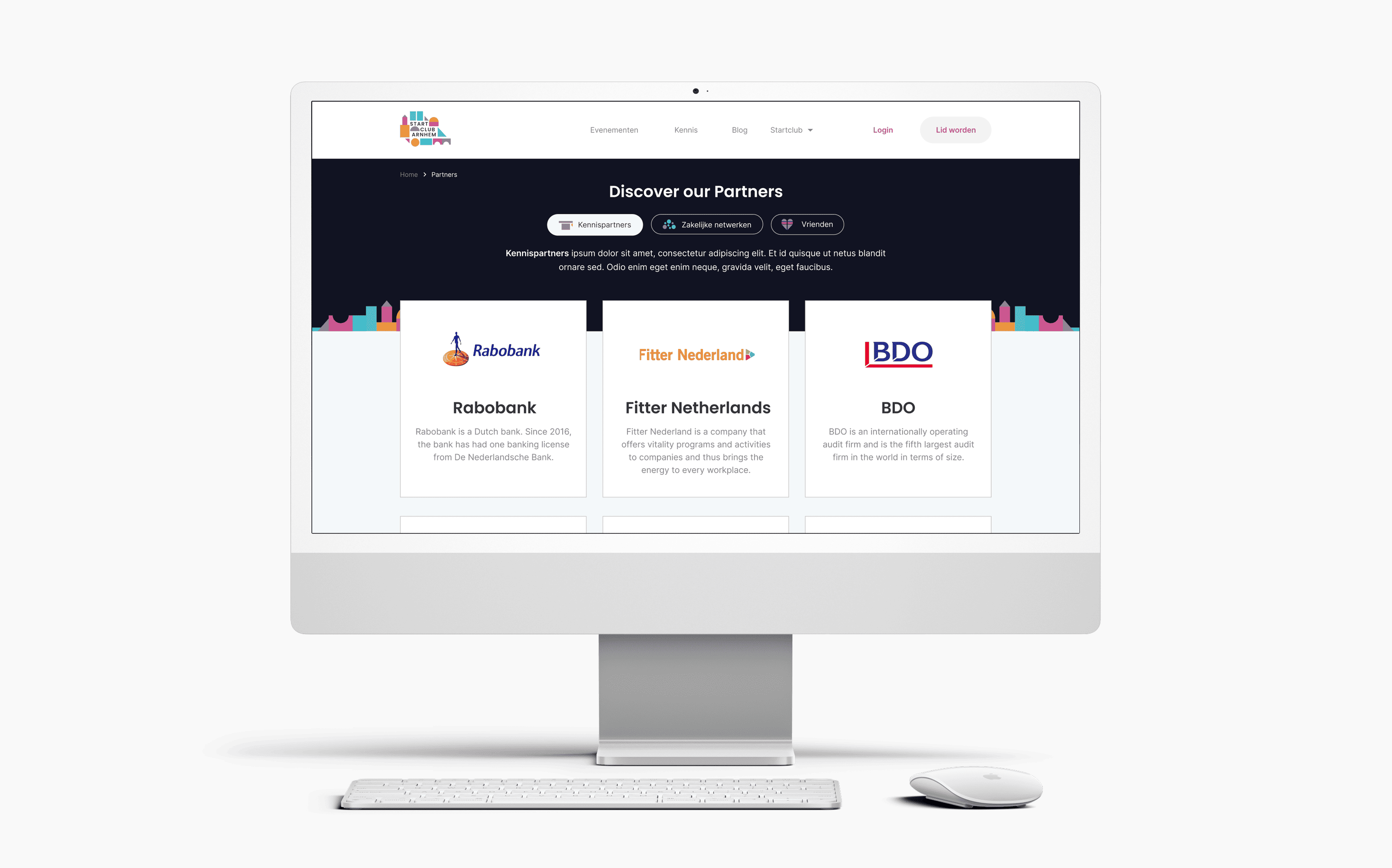
SCA aims to support and facilitate entrepreneurs throughout their startup journey, ensuring that Arnhem's founders have access to a thriving community. The platform serves coaches who provide workshops and materials, as well as startup founders (starters) looking for growth tools. Additionally, SCA is supported by key regional partners like Rabobank and HAN University, and also caters to co-working space owners.
Design Process
Structure of the website
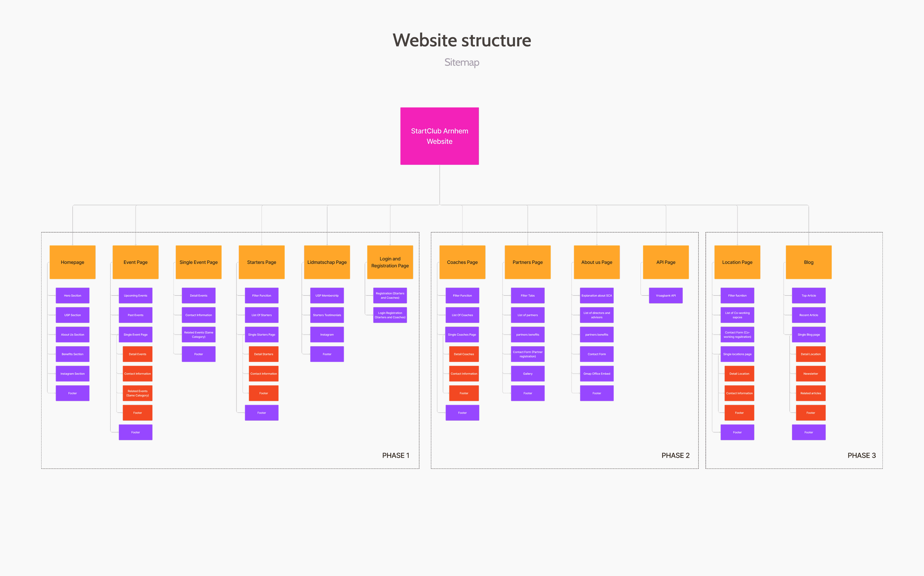
The first thing I did was make a sitemap of the website. It was important to first understand the structure of the website and how everything was connected. This helped me to identify the most important pages and how they should be organized.
AIDA Structure
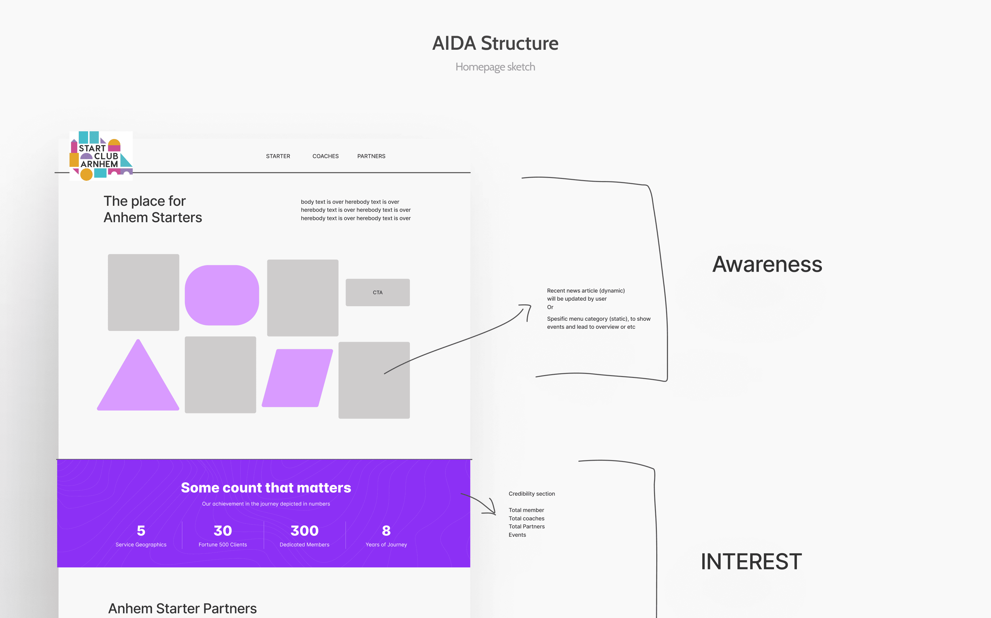
After defining the pages, I created an AIDA (Awareness, Interest, Desire, Action) structure to map out the user journey for the redesigned pages. This ensured each page was optimized to guide users effectively through the awareness, interest, desire, and action phases of their interaction with the website.
Design Branching Strategy
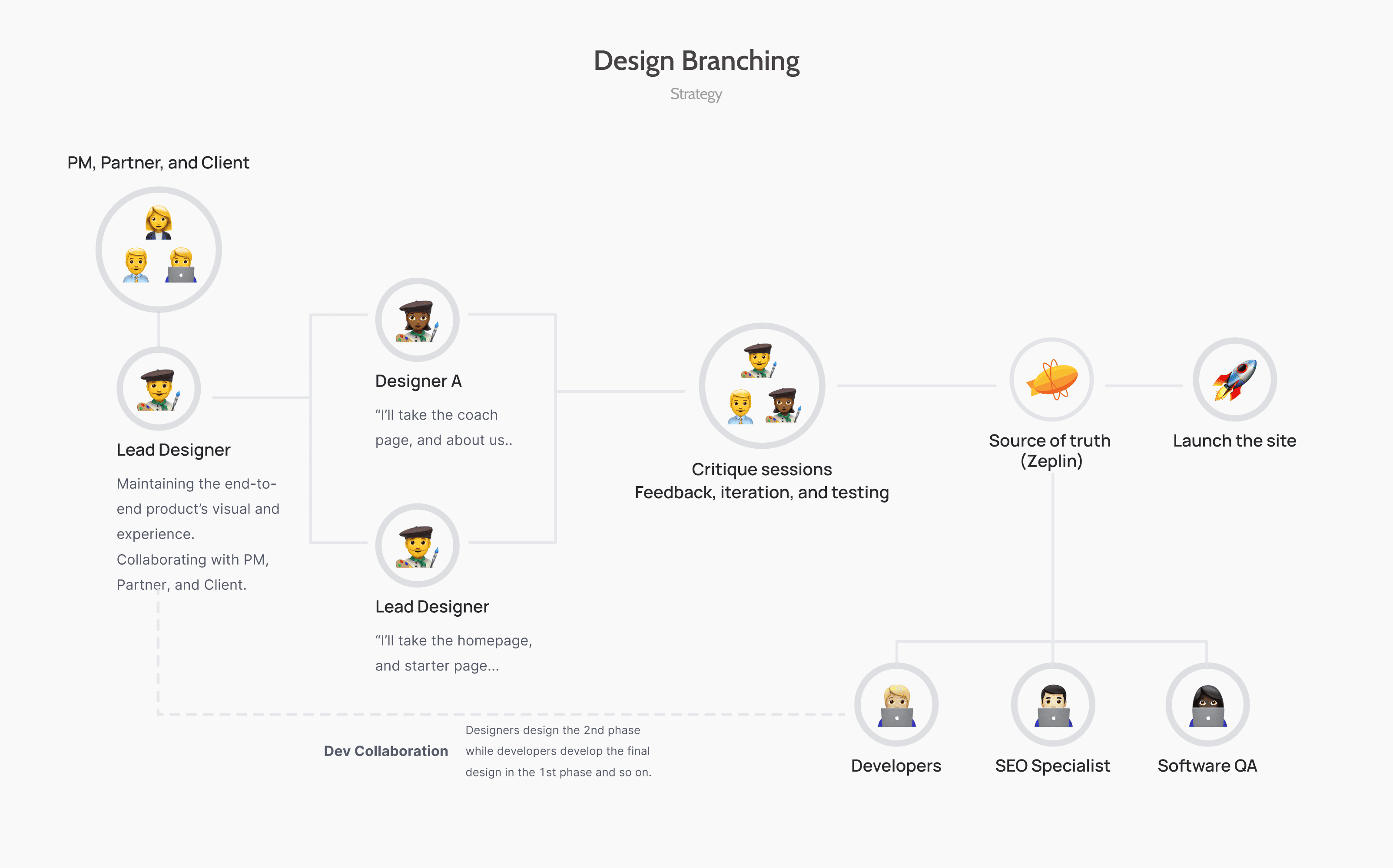
Two months was a tight deadline to deliver a full website with more than 15 pages. To meet this challenge while maintaining high client standards and UX quality, we brainstormed a strategy to split the project into three phases and utilized design branching.
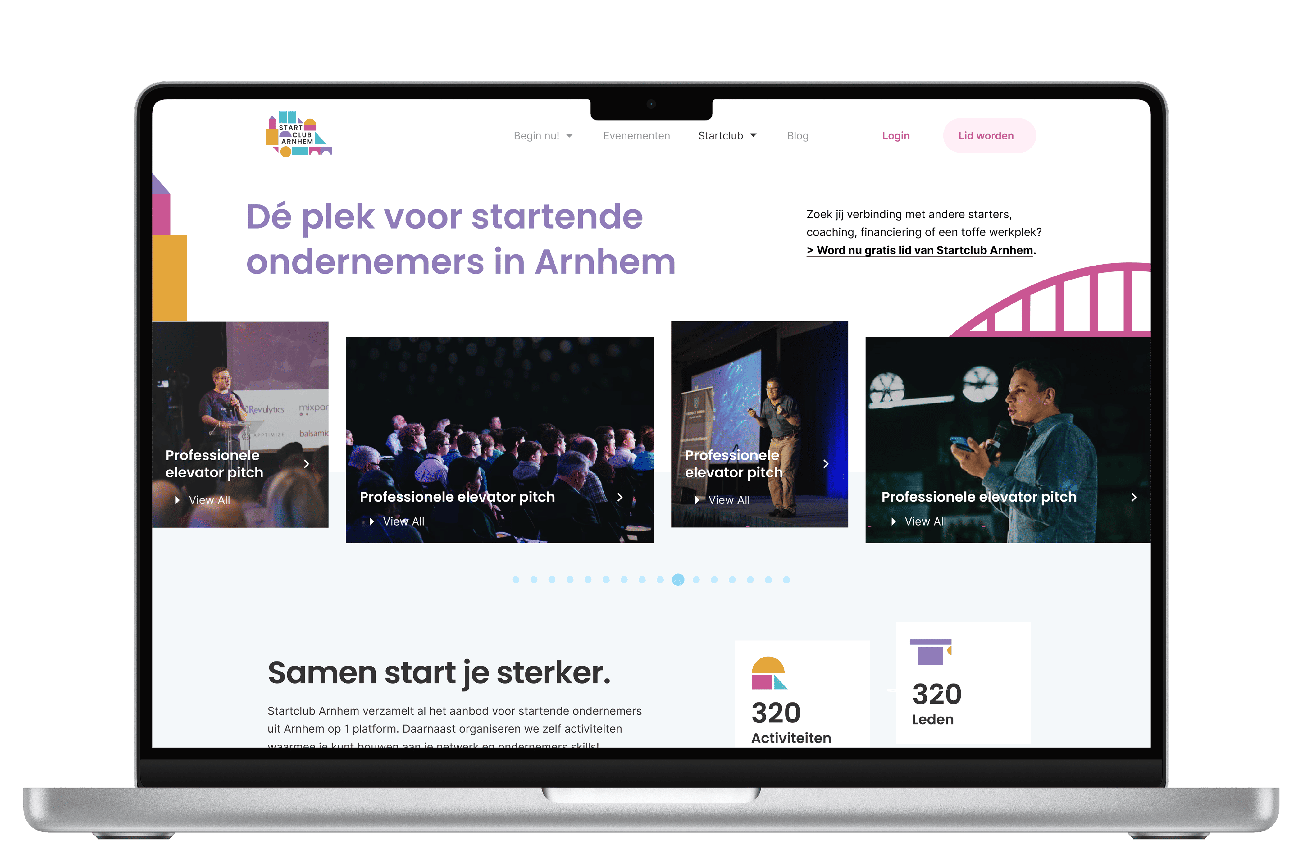
Visual Design
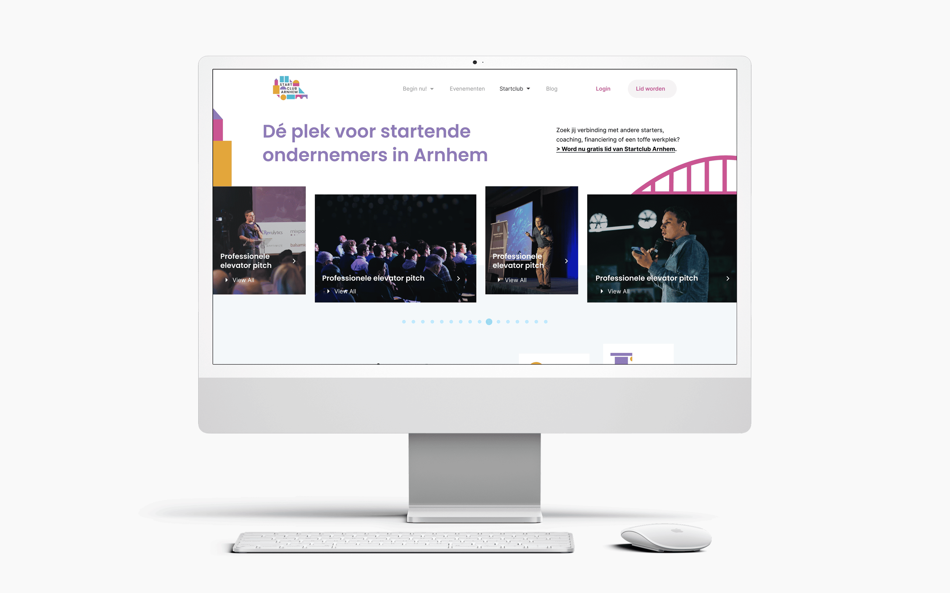
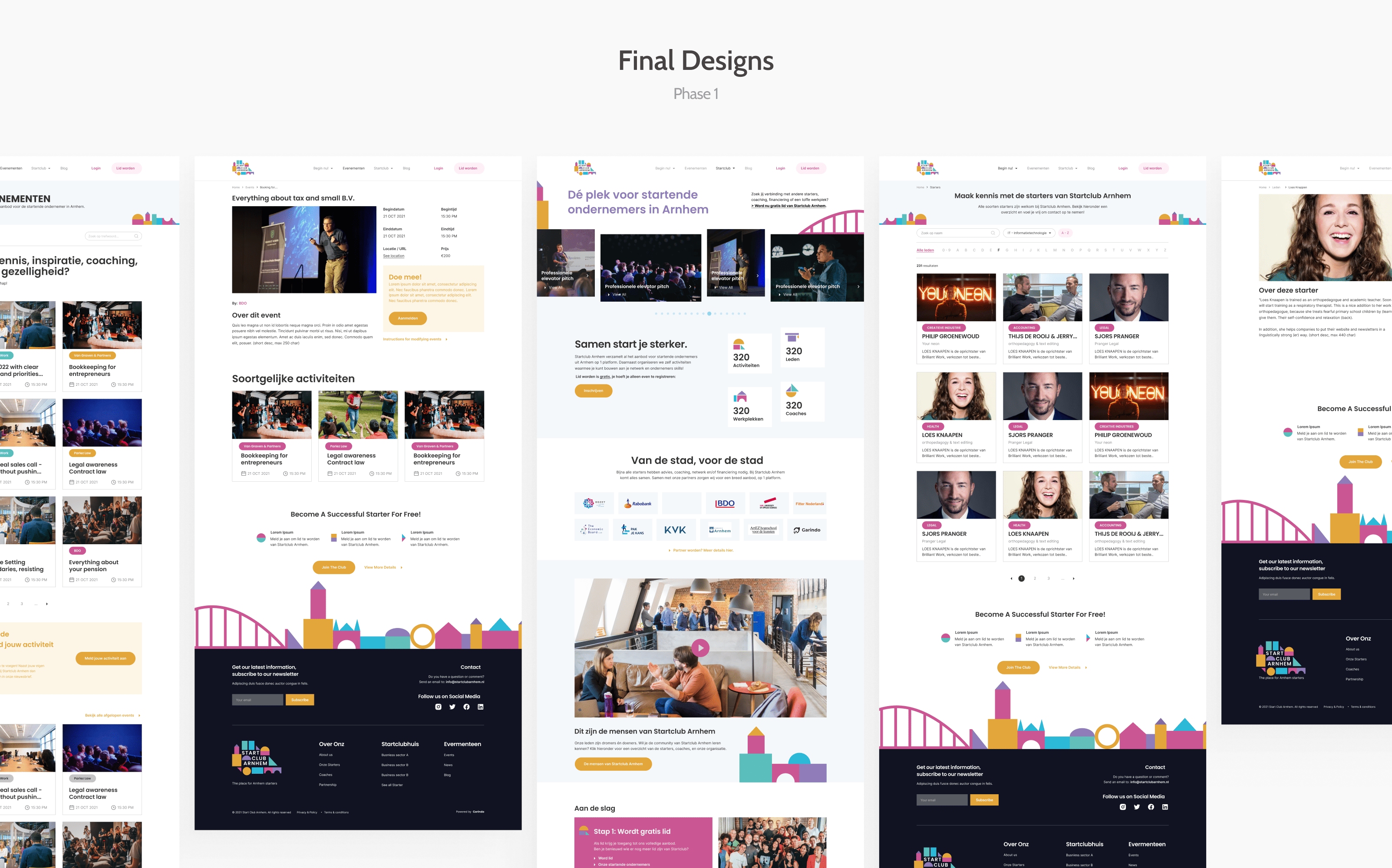
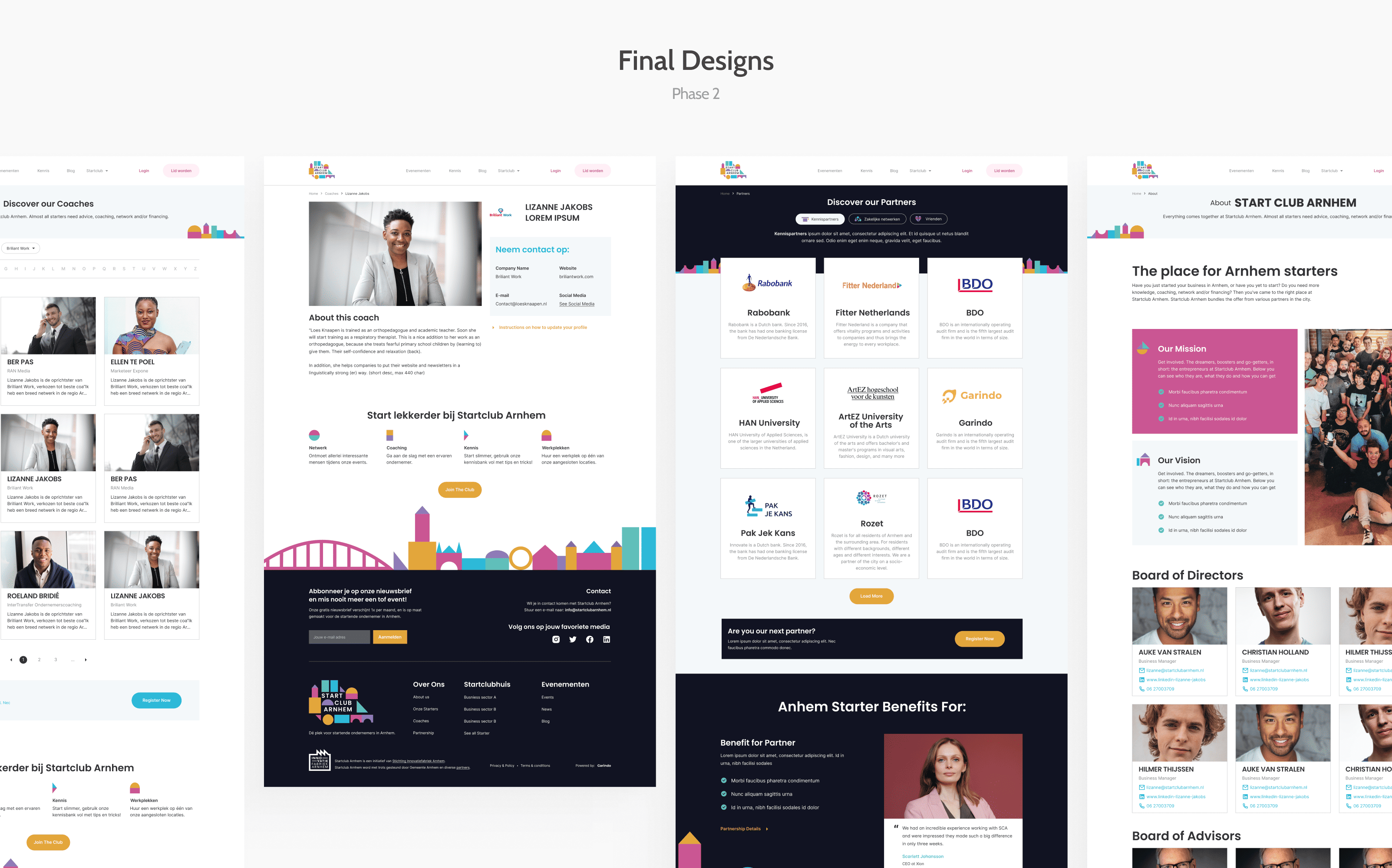
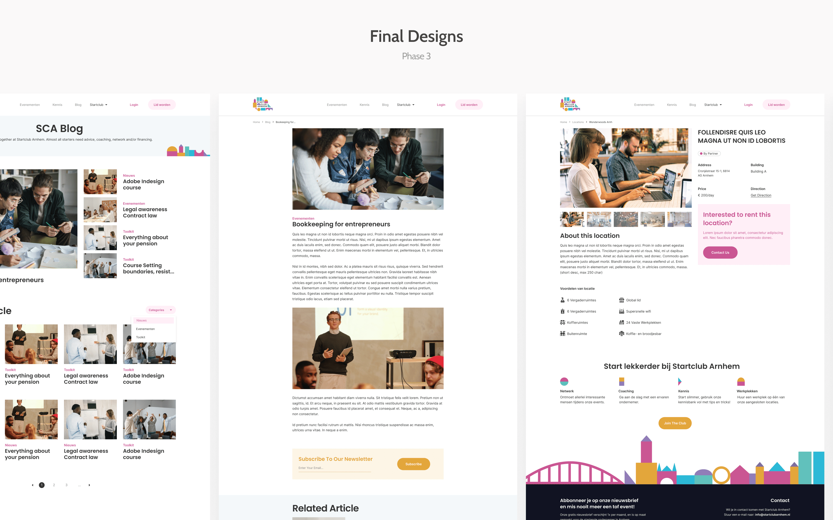
This is what the final designs ended up looking like
The final design features a clean, modern aesthetic that reflects SCA's vibrant community. Below is a comparison of the redesign alongside the key pages that were developed during the first phase of the launch.
Final Deliverables
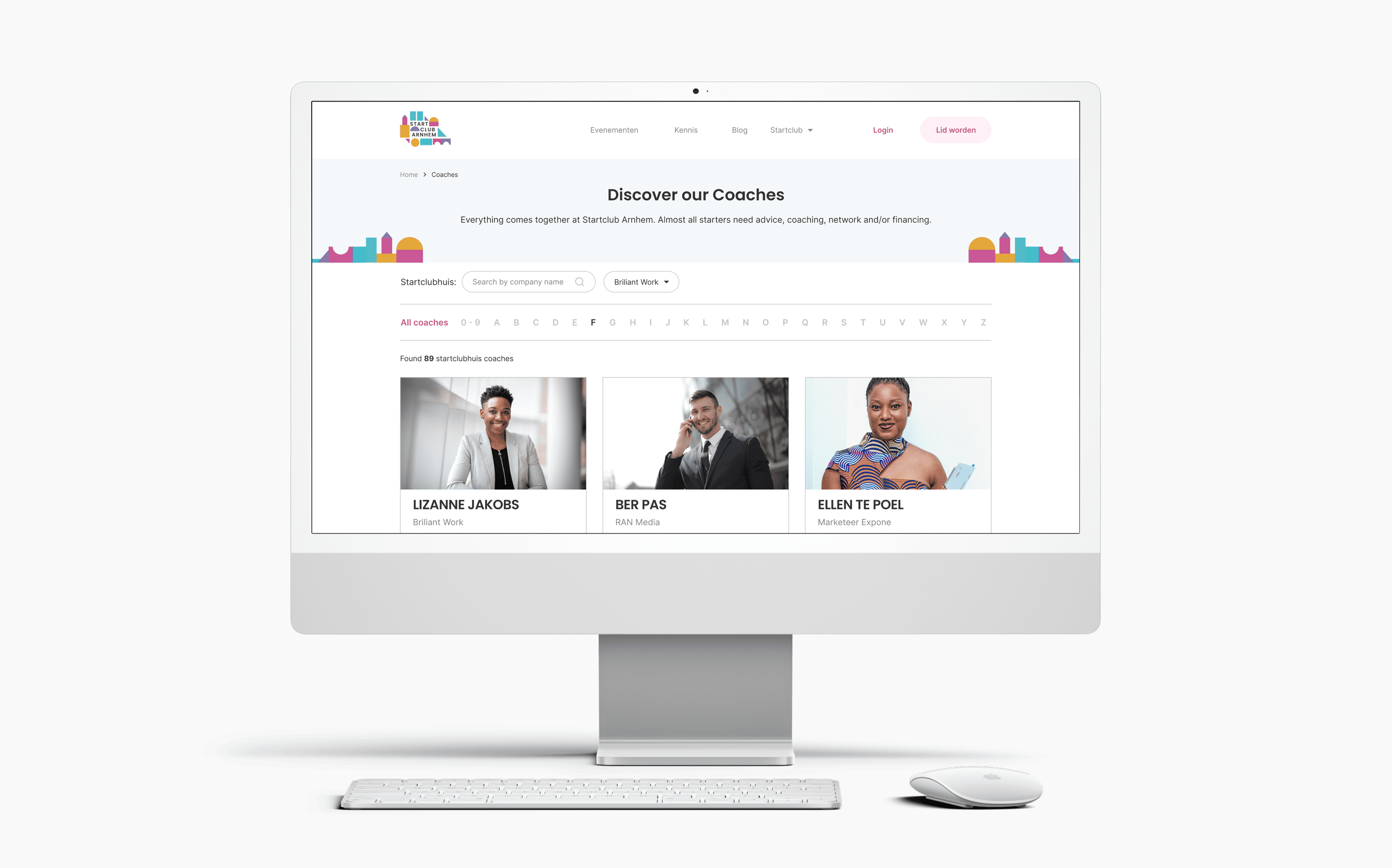
All of the screens I designed
Below is the complete set of designs delivered to the client, covering all essential pages for the platform.
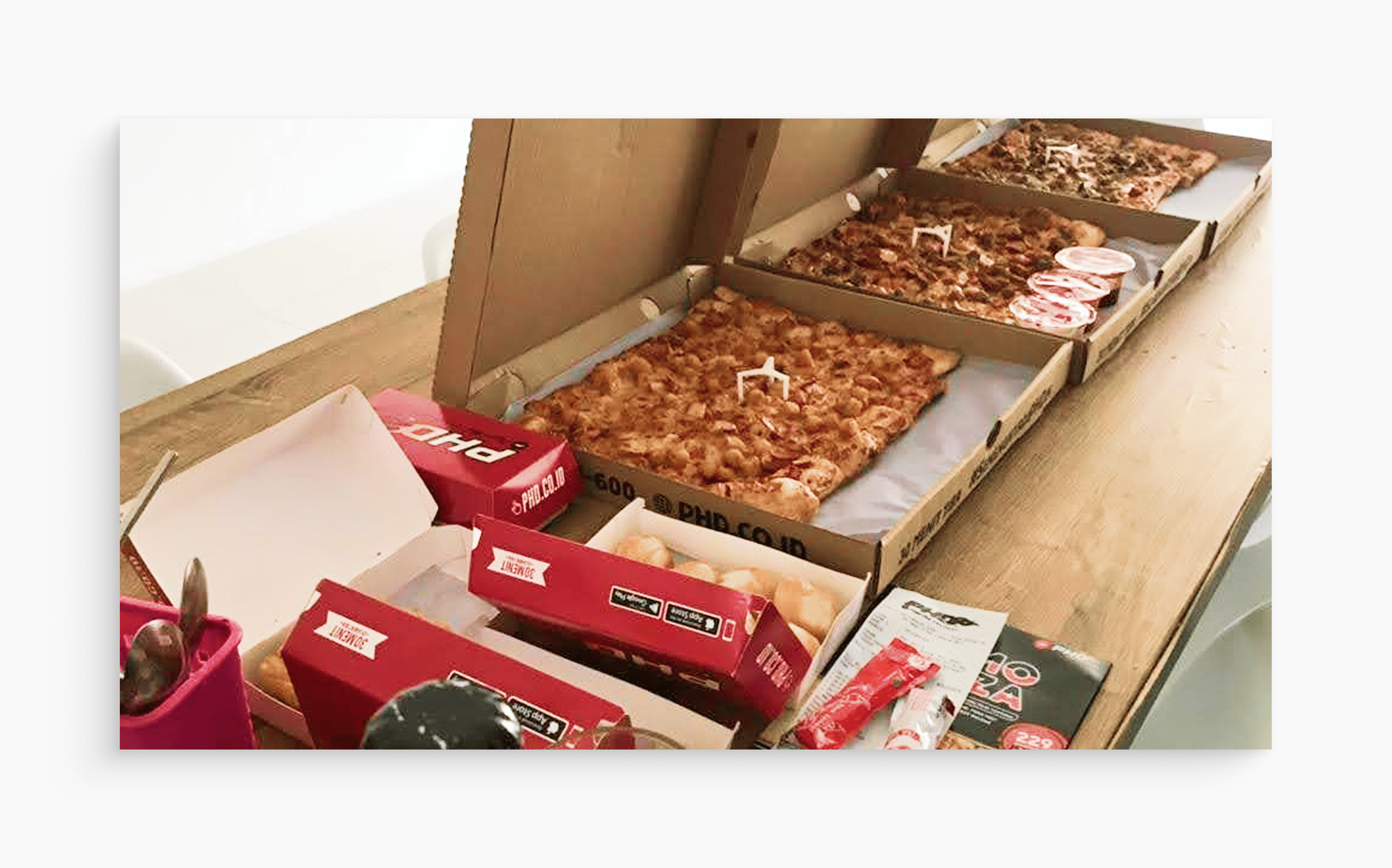
We successfully launched the website and celebrated with a pizza party 🎉🍕
430
(+30.7%)New Community Members
944
(+62.5%)Sessions
35.81%
(-11.1%)Bounce Rate
9m 40s
(+97.7%)Average Session Duration
“Our new website fits with all our needs and we get a lot of compliments on how cool it looks!”
- Paulien Zwiers, Community Manager at StartClubArnhemOther Projects
-portrait.png)
.png)